Accessibility and the use of identifying colors in Gespet.
Celebrating World Usability Day:
Gespet Solutions are Accessible, Intuitive, Efficient, and
Inclusive
On World Usability Day, we want to take this opportunity to showcase how we’ve carefully designed our solutions to be intuitive, accessible, and incredibly easy to use.
But what does it really mean for software to be usable? Usability refers to how easily a user can interact with a system or product to achieve their goals efficiently and satisfactorily.
Usability is closely tied to ACCESSIBILITY. Accessibility refers to the system's ability to be used by people with different abilities, including those with physical, sensory, cognitive, or technical disabilities.
Here are some key principles of accessibility in software:
1. Perceptibility
The information and components of our solutions are presented in ways that users can perceive, even if they have visual or auditory impairments.
2. Comprehensibility
The content is clear and coherent, making it easy to understand even for those with cognitive difficulties.
3. Operability
The system can be used across different devices.
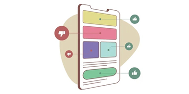
Now, let’s talk about a practical example: COLOR.
Using identifying colors to enhance accessibility in software provides several important benefits for users, especially those with visual or cognitive disabilities. For example:
Improves Visual Understanding: Colors help to quickly differentiate between various functions, categories, or alerts within an interface, making it easier to navigate for all users, regardless of their visual abilities.Facilitates Accessibility for Visually Impaired Users: Using the right combination of colors can improve readability and perception, especially for individuals with low vision or color blindness. High-contrast colors make elements more visible.Increases Efficiency and Speed: Associating specific colors with certain actions or sections of the software helps users quickly identify the information or tools they need, reducing search time and improving overall efficiency.Enhances Consistency and Visual Memory: When colors are used consistently to represent actions, states, or categories, users can more easily learn and remember how to interact with the software, improving the user experience and reducing the learning curve.Promotes Inclusion: Incorporating identifying colors to improve accessibility demonstrates a commitment to inclusion, ensuring that the software is usable by a broader audience, including those with various disabilities.Prevents Errors: Clear and distinct colors can warn users of potential errors or issues, such as alerts or confirmations, helping to prevent mistakes and improving the software’s safety and reliability.Supports Content Differentiation: In complex interfaces, using color can visually segment or group content, making it easier to digest and navigate.
Key action buttons, such as Delete, Save, or Send, are always highlighted using the same identifiable colors, with bright, contrasting tones. Meanwhile, secondary buttons use more neutral colors.
In short, we use identifying colors to enhance accessibility, which contributes to a better user experience, making Gespet’s solutions more intuitive, efficient, and inclusive.
Want to learn more about our solutions? Visit www.gespet.com and try them for free, for as long as you like.
Did you find it interesting?
If you have any questions, you want to propose that we write a help guide or a post on a topic or you just want to chat with us, don't hesitate. We are delighted to talk with you and get your opinion.

LANGUAGE
CATEGORIES
POPULAR POST
Pet business hours, holidays and non-working days in your scheduling software
New regional settings in Gespet
Black Friday Ideas for Pet Businesses
New features included and user suggestions
The all-in-one agenda every breeder needs
Differences between full invoice and simplified invoice
Electronic invoicing with TicketBAI and Verifactu
New features included and user suggestions
Configurable online booking form and GDPR
FOLLOW
JOIN OUR TEAM
Follow us on social media and join our mailing list for advice and tips to run your pet-care business
TAGS:
usability
accessibility